Friday, February 27, 2009

food! a delicious self-torture sampler

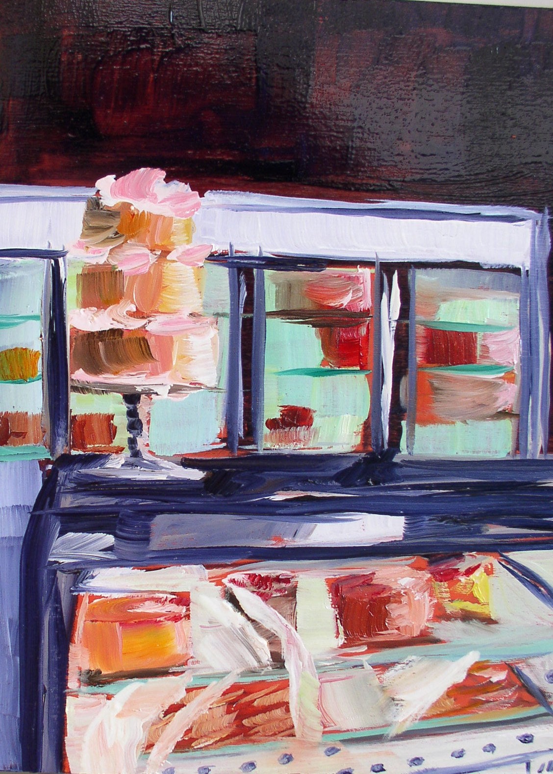
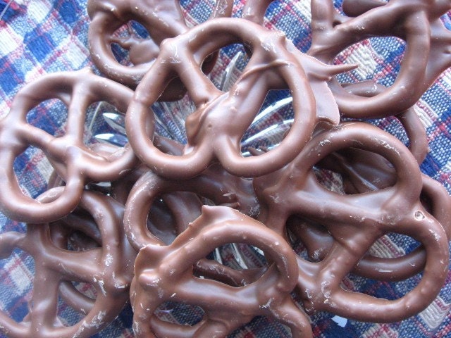
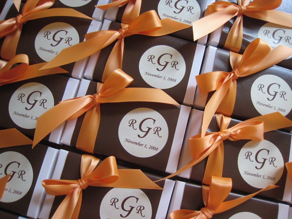
Pastry Counter with Cake Original Oil Painting Daily paintingSpecial Occasion Chocolate Covered Pretzels
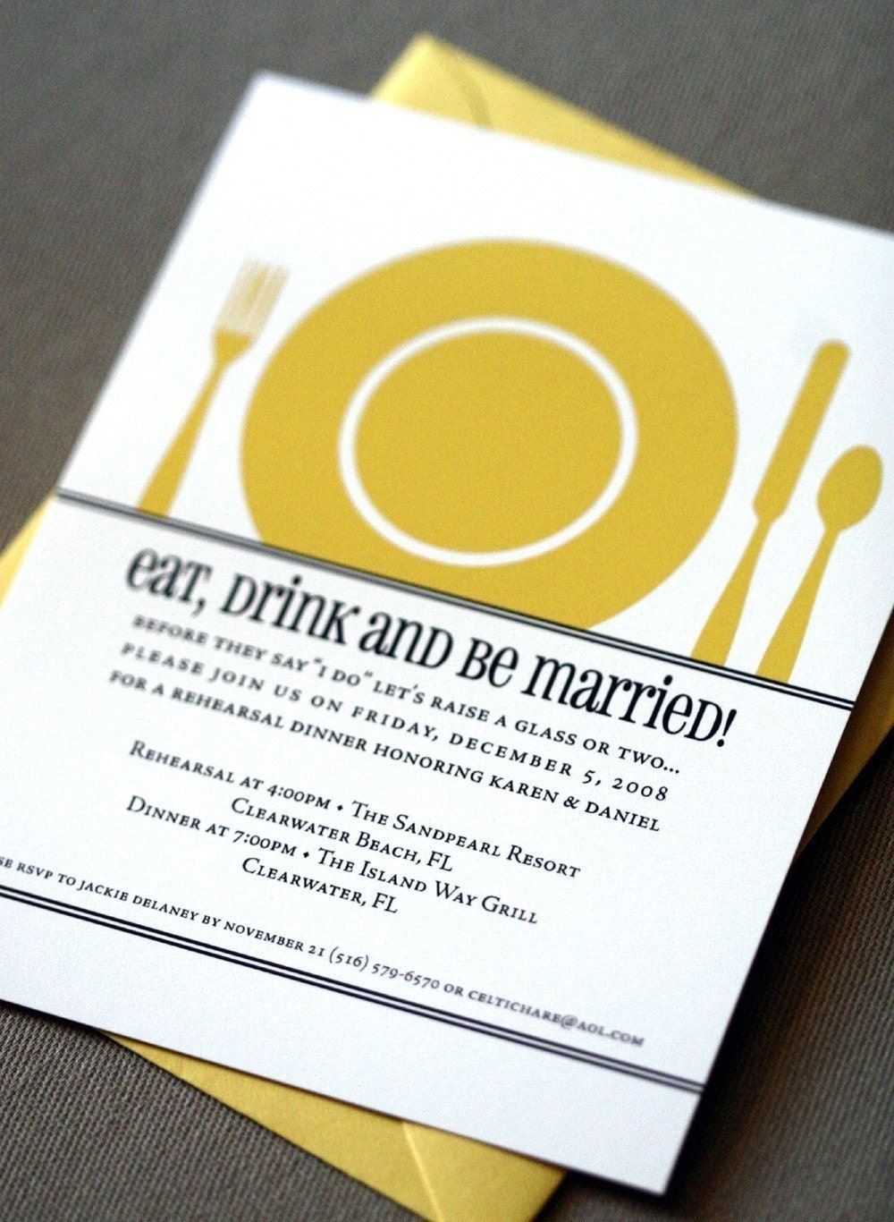
Itty Bitty FavorsThe Plate Invitation
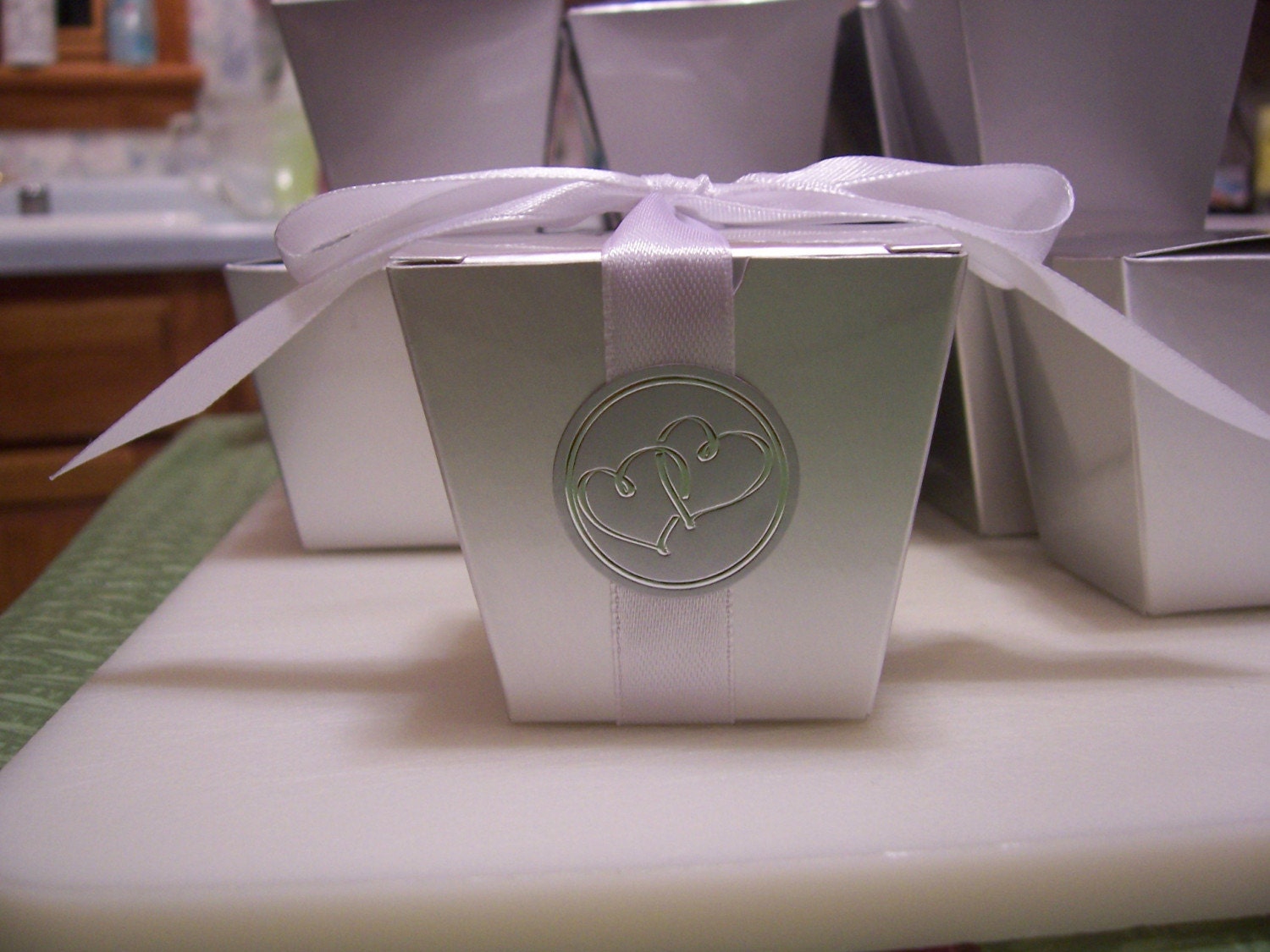
Fresh, Delicious Butter Crunch Candy Custom Wedding Event FavorsDIY - CAKE BITES - CAKE BALLS - RECIPE - PDF
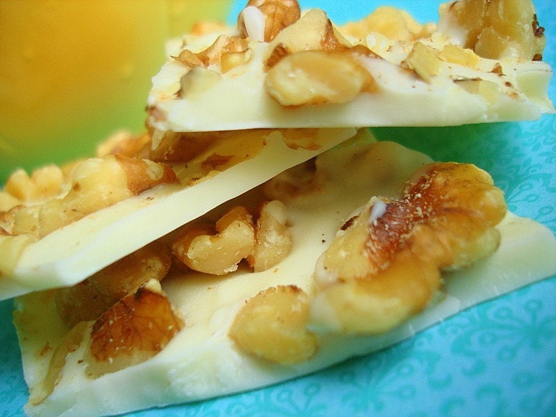
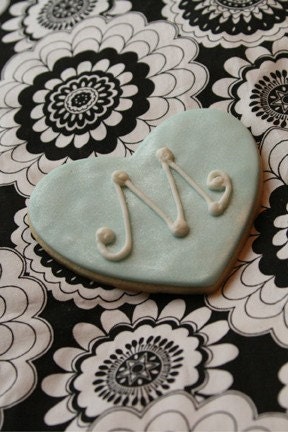
White Walnut Bark monogram heart
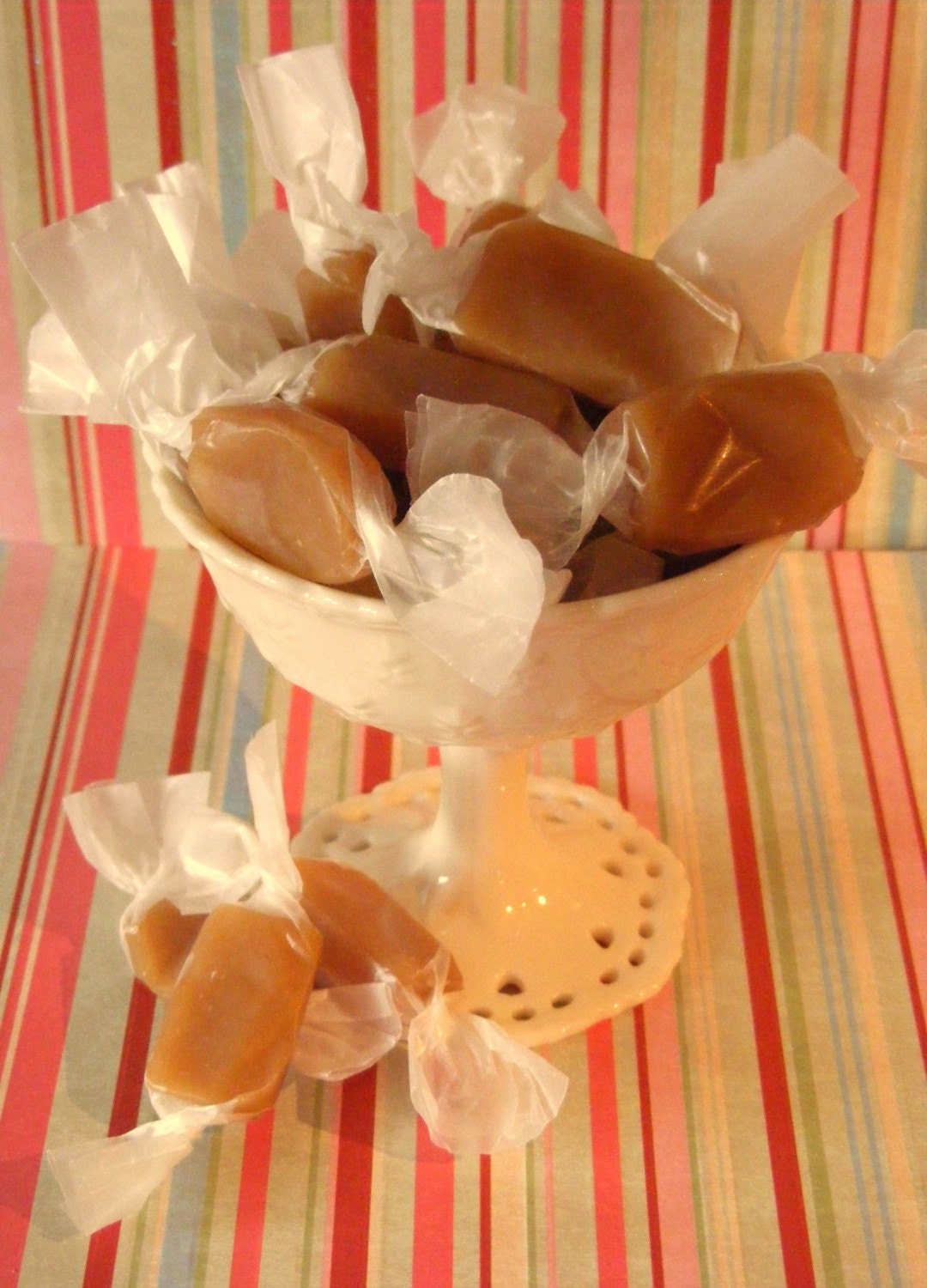
Wildflower Honey Favor JarsCARAMELS - Fleur de sel and vanilla caramels - 8oz
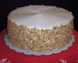
Caramel Center TrufflesFancy Carrot Cake
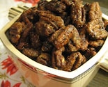
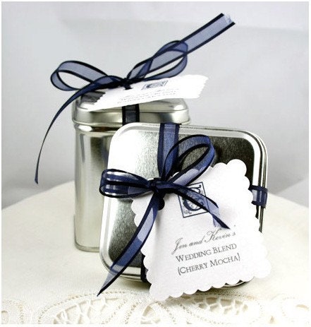
Love at First Bite Sweet and Spicy Pecans ONE POUNDYour Custom Blend - Wedding Favors Or Special Occasions
Chocolate Covered Cherry -- Wedding/Anniversary FavorsWhite Chocolate Macadamia Fudge Sandwiches-1 Dozen
Almond Nougat Candy - 1/4 LB - approx. 10 piecesSave The Date Postcard or Invitation                            - Tea and Coffee-
{each photo links to its shop}

there. what did i tell you. not just food, DESSERT.
edible wedding favors, etc. can't bring myself to look any longer.

ohhhh. lemon cleanse, when will you end.

label love

jamieoliver1
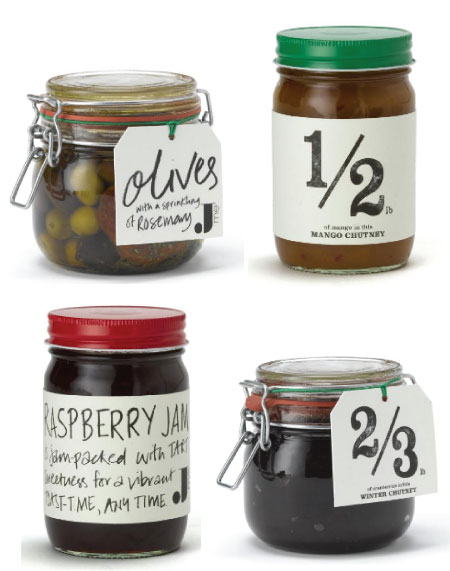
Great label happenings over at Jamie Oliver's food shop with offerings of simple hand drawn and old typewriter printed tags. (Via My Aim is True).

jamieoliver2

Friday's Satellite Debris


Before we stop posting for the weekend and start working on our weekly newsletter, we have a few news items and things to mention (satellite debris - borrowing the name from a local TV news segment here). To accompany this post we bring you this awesome print, Parkway Motel Pool by 33 Stewart Avenue. With affordable art on the mind, this one's such a great deal and hard to pass up.


With that said, more deals to mention. In celebration of having their 500th sale on Etsy, Chocolate and Steel is offering a weekend sale (2/27-3/1) of: Buy 2 or more pieces and get 50% off your entire order (not valid on supply purchases). Enter "Etsy500" in the notes section and your paypal invoice will be adjusted.


Sharon Montrose is having an amazing giveaway on her blog (ending Monday) - she's giving away three framed Bunny "mini-prints"! Leave a comment on her blog, here.

Karen Kang is offering free shipping, click here to find out more and we love Stephanie Levy's new lounge print (below)! Have a great weekend!

L&G Storytime Part III: Decorating Without Impoverishing Yourself?


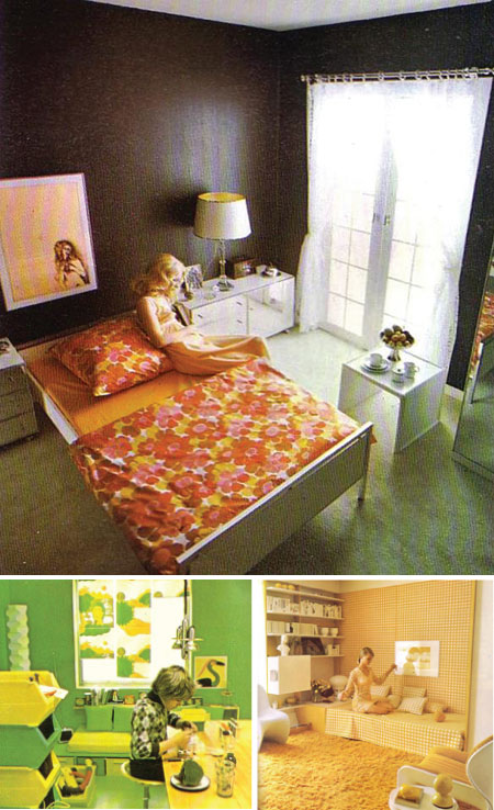
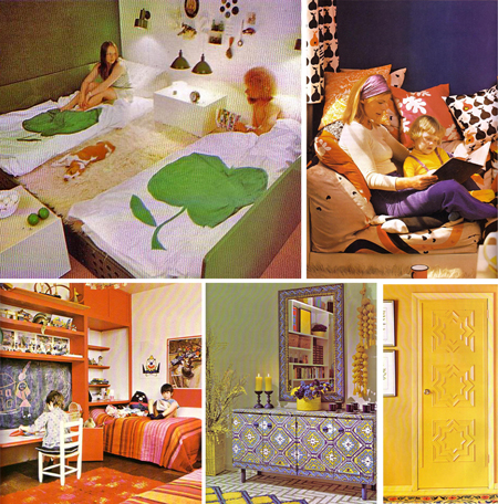
In these hard financial times it good to know you can turn to L&G Storytime right? We understand your need to live in a fabulous space without spending a bunch of mullah. We have the perfect book for you: “How to Decorate Without Going Broke” by Barty Phillips, 1974. Just look at the cover. We love how ladies can look so good even when applying wallpaper with a brush!

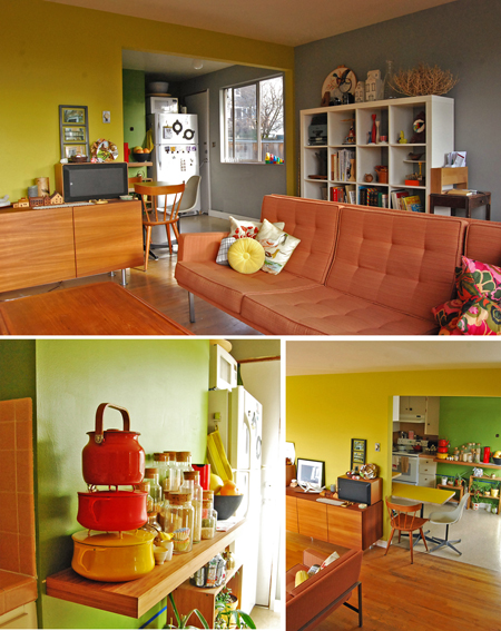
We have been collecting vintage decorating books with a fury after purchasing our first house (it’s actually a duplex, see all of our adventures on our house blog thirty-thirtytwo). The books have definitely provided us with bountiful inspiration. “How to Decorate Without Going Broke” is one of the most inspiring. Here’s why (with examples of our own):

sectionone
1. Bold colors: Who has the balls to use color like this these days?? Bright oranges, greens, yellows, even pinks. It’s what inspired us to dash our walls with Kelly green and mossy yellow and to highlight our salmon colored couch and counter tops with contrasting shades of grey.

LG_home

We like to use bold color enamelware to use as accent color and it adds an element of fun while cooking, too!

Section2

2. Patterns and texture: Wallpaper was king in 1974 and they used it and other patterns fearlessly. Look at the great textiles used in curtains, pillows, and bedding and the boldly decorated furniture! We haven’t figured out how best to incorporate this into our home, but when we do…look out!

section3

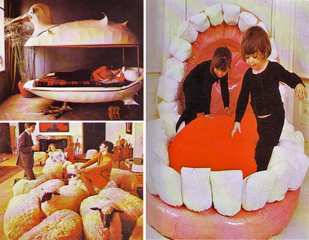
3.Playfulness: Imagine a cocktail party where people are lounging around on sheep, taking a nap in a seagull, or your kids playing in a gigantic stuffed mouth. Seriously though, in these stressful times its important to be able to escape to a place that doesn’t take itself so seriously. We like to surround ourselves with the fun objects, books, and art that we’ve collected over the years. Psst! But we're also working on a life-size dinosaur slide. Woo hoo!

We have a ways to go to achieve the awesomeness that’s contained in the pages of this fabulous book, and we hope you find some inspiration to go wild with decorating like the old days. Enjoy!

Jean&Dylan

Ladies&Gentlemen Blog
Ladies&Gentlemen Shop

Winter Projects


We howled when we read this post from the home blog, thirty thirty-two of our Story Time contributer's Jean and Dylan from L&G. Per their friend, Stuart's suggestion, they decided to ditch the driveway and put in an aquarium. Click here to read. {Photoshopping by their friend, Stuart Ottenritter}.

Designer Call Out - Koma Designs


Koma Designs and Furniture Gallery in Toronto are sending a call out to designers to showcase their work in their bright, unique 2000 sq ft gallery space on Queen Street. They are offering a unique opportunity to designers where you'd be able to rent out a space in their gallery and along with that they will promote and represent your work.

I know there's a few similar places like this around, for example, Cocoon in Vancouver, where they rent out space in their shop to local designers. So perhaps this is another great way to help out the local economy and artist. The deadline for submissions to Koma is February 28th! For more info visit komadesigns.com.

Font Friday!

Pee Pants Script by Kirk Shelton. {Click here to donate to Kirk Shelton}


Aristotle Punk by Dirt2.com. {Donate to Dirt2.com here)


Cute Tattoo font from Dirt2.com, $5


Impact Label by Michael Tension. {Donate to Michael Tenison here}.

Blackboard decals

il_430xN.56576923
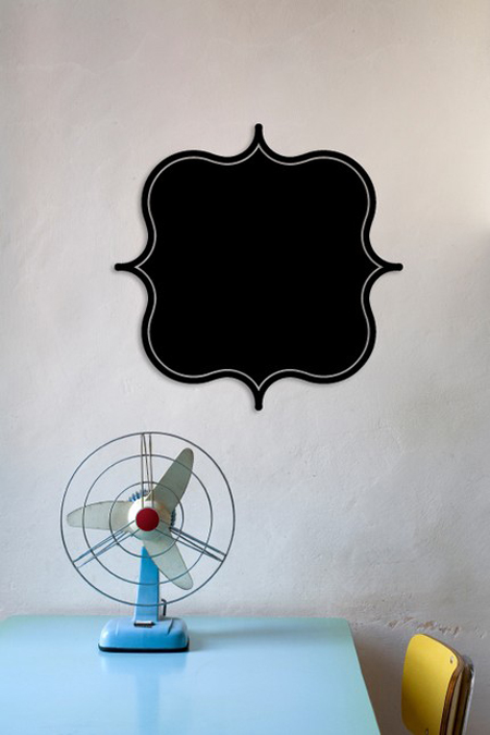
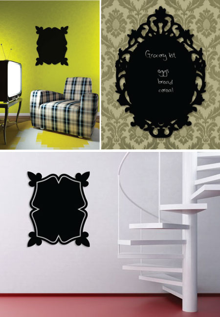
A novel take on the decal and the blackboard. Spell It Out Designs out of Utah have created these self-adhesive wall decals made with a blackboard surface. Perfect for the entryway we say! (Via lilygraceonline.blogspot.com/).

a2

Thursday, February 26, 2009

Islands In LA Friday!


A reminder that Islands in LA (Fold Pop Up Art Show) is happening Friday, February 27th at Poketo. They're setting up a photo booth for the show and beginning at 3 PM, all are invited to grab a drink, hang out with the artists, and witness new pieces being created from start to finish to be showcased later that evening. At 6 PM the official party will begin with a release of a special edition Poketo tee shirt featuring a collaborative design by the artists. The spontaneous nature of the show will allow the public to purchase all original art right off the walls to be taken home that evening.

Friday, February 27th
3 PM - 6 PM: Open studio with artists
6 PM - 9 PM: Official Artshow/ Party
Poketo Studio:
510 South Hewitt Street, #506, Los Angeles

Collaborations & Crystals


House and Home has a couple interesting videos from IDS09 on two different installations. Crystal Clear, where six design firms revealed their creations using crystals to show how they could be used for lighting, for furniture and architecture for example. And Collaborations, where designers were asked to use cork, corian and paper stone to create various pieces. The videos are not embeded so one will need to click here to view.

Grouping and Hanging Affordable Art


This week in our newsetter we mentioned we were going to post about putting more affordable art pieces together, which we have found is not always an easy task (making them all work together). So here we hope to share a few tricks, links to ideas on how to hang them, alternative ideas for frames etc. We'll start out with these beautiful encaustic miniature beeswax paintings by South Carolina-based artist, Katie Runnels. If you visit her shop, The Constant Gatherer you will find a few of these gems left which, as she shows in the above photo, are adorable as a set. We love how she's hung these in a "gallery style" grouping. What's nice about these too is, no frames are needed, which makes for a nice saving we often forget about when buying art.
bueller-and-caplan-group

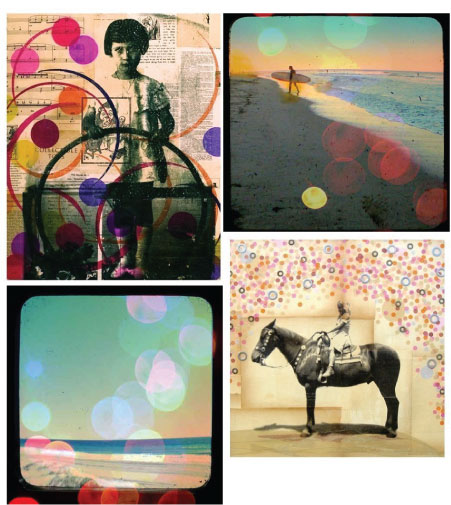
We love these polk-dot-themed prints and photographs grouped together by two etsy artists and PHM vendors , Michelle Caplan (prints) and Bueller (photographs). These would look great in black RIBBA frames (there's so many sizes to choose from) and black frames create contrasts and put the focus in the room on your pictures. Or in the extra affordable CLIPS (frame with clips) from Ikea which look great against a colored wall. Perfect for a girl's (teenager) room or a nice hall grouping for people like us who love horses and surfing!
mattetrio

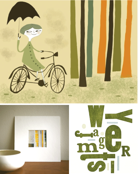
These next three just spoke to each other we thought. Matte Stephens is such a favorite of ours and this print titled, Vivienne on her bike has a light humourous feel to it and connects so well we think with the Learning Curve polaroid collage from Trampoline and Talking in Circles letterpress print from Green Chair Press. These all could be framed in white, light wood or darker frames. But personally we like the idea of white.
andrea-shear

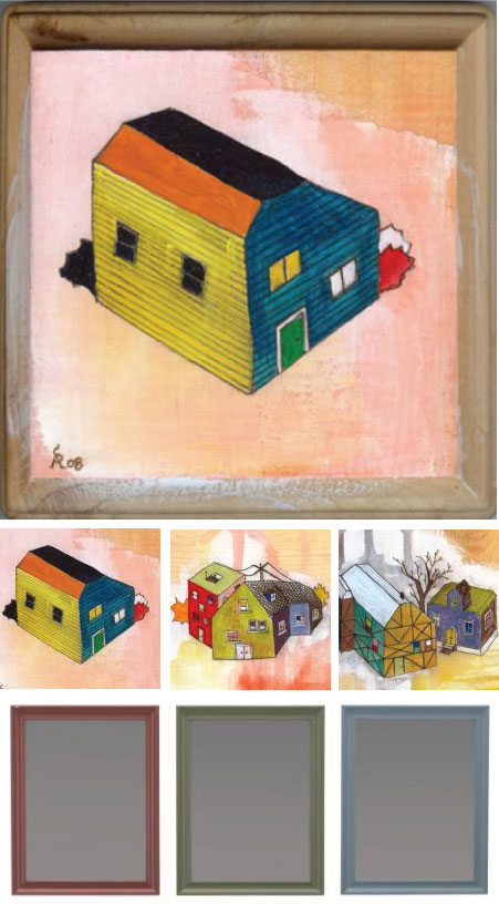
Los Angeles-based artist, Andrea Shear has such great colors in her Little Boxes original paintings series which come already included with extended edges of the plaque with hooks, which is such a great feature. Another idea is if you have prints or paintings with similar colors, we love the idea of different colored frames or mattings to compliment them. Ikea has these Fanaholm frames in assorted colors that would work really well for this idea. A link here shows a great example of this.

As far as where pictures should be hung. Really it's entirely up to you of course (whatever makes you happy), but if you are cursed (almost is what it feels like at times) like me (and seek advice), we feel pictures need to be hung (not too high) and not too low - although there are exceptions of course anywhere. If I'm visiting a place where the picture is hung too high or it's crooked or unbalanced I feel cursed, where i, it distracts me to the point sometimes that I loose track of my conversations or there's an urge to walk up and straighten it. So for me in my home, I need that balance and preciseness. Not preciseness where I measure, but precise where they are not too high or two low. I think if you're hanging art above furniture for instance they can be hung somewhat lower if they are larger pieces, perhaps starting even just a few inches up from the furniture itself (4 to 5 inches perhaps) above the furniture line is a good place to start if they are desks, credenzas and dressers. And perhaps a bit higher if it's a couch. If they are smaller then it just depends on how many you are placing together. If you have many and it covers a wide area, then you can start lower. It's just all in balance. Writing this, I'm realizing how crazy I am about all this. So with that said, perhaps I've said enough. Just that pictures really shouldn't be hung above your head (when standing) unless you have a gallery style setting and there are pictures at eye level scattered randomly above and below eye level. I suggest you have fun, invite a friend that enjoys this particular activity as much as you (or even more than you) and make a visit out of it. My family always did that, and I suppose that's where all of this stems, it was fun, we all gave our two cents worth and in the end a beautiful display was created. Anyway, hopefully some of this makes sense and is of some help for those that do seek advice. The best advice is I think to try and hang art so it doesn't look too pre-meditated, yet considered.

For those of you who don't need the advice I welcome your opinions in the comments, as I love new ideas and ways to hang art (especially affordable ways). Other links about alternative ideas for hanging art that we've posted previously for reference are Hanging prints using wooden pant hangers, bull dog clips and check out The Art of the Display posts we've done as well as catch some inspiration from our The Art of the Display flickr group where we found this great display below by Saidos da Concha.
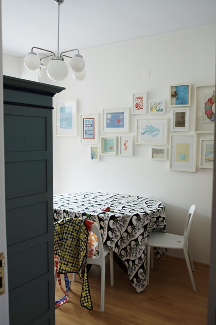
ikea family live :: spring 2009

Sarbe Sale


Sarbe Invitations are having a sale which ends this saturday the 28th February. They've discounted lots of ranges so don't miss out! For more information visit their {website} or call their studio on 07 5528 0330.

(Image Credit: Sarbe - this invitation is for illustrative purposes only and may not be included in the sale.)

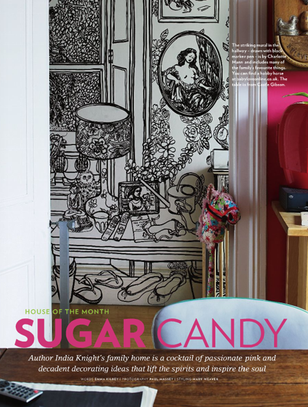
Charlotte Mann Mural at India Knight's Home

Picture 3
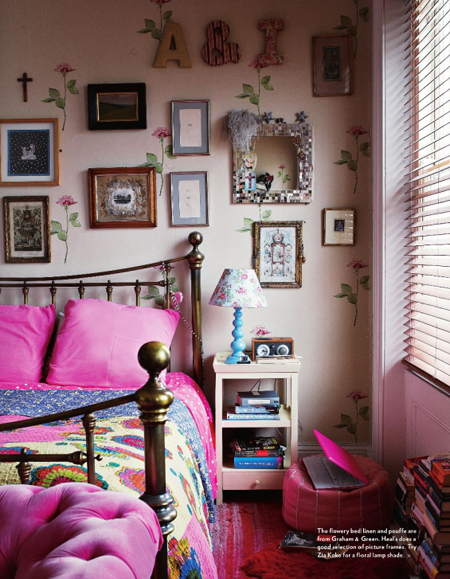
Saw this striking wall mural in the March '09 issue of Livingetc magazine and just had to show it here. Drawn with a black marker pen by Charlotte Mann, it includes many of the author's India Knight's family's favorite things. I found more images of her wall mural here, which if you have time is a must-see! Also thought both her kitchen and bedroom were really interesting (love the rose wallpaper amongst the pictures). Photography Paul Massey, Styling by Mary Weaver.


Picture 5
Picture 6